The Fleet
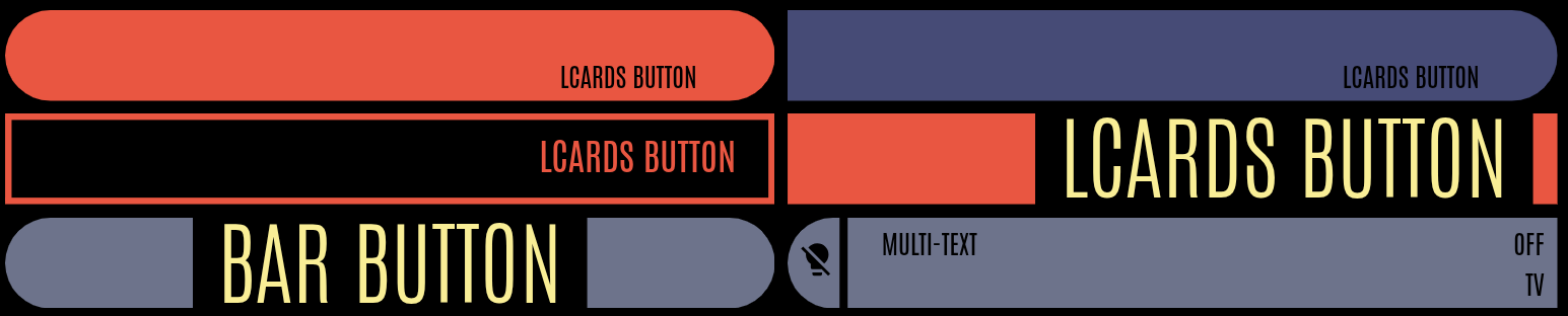
lcards-button
All standard LCARS buttons, plus advanced multi-segment controls.
- Built-in preset library: lozenge, bullet, capped, outline, pill, text, and more
- Component mode — embed SVG components (D-pad, Alert, custom shapes) with per-segment interactivity
- Canvas-based background animations — stackable layers with zoom and pan
- Rules Engine integration — styles hot-patched at runtime
Common Card Features
Features and concepts shared across the card system:
| Topic | What it covers |
|---|---|
| Common Card Properties | id, tags, height, width, grid_options — properties shared by all cards |
| Colours | Colour formats, state-based colour system, resolution order |
| Actions | tap_action, hold_action, double_tap_action — all action types and options |
| Text Fields | Multi-field text system — placement, fonts, colour, templates |
| Templates | Dynamic content: JS, Jinja2, LCARdS token data source templates |
| Animations | Per-card animations with multiple trigger types |
| Background Animations | Canvas-based animated backgrounds (grid, starfield, nebula, etc.) |
| Sound Effects | LCARS-style audio feedback for interactions and alerts |
| Rules Engine | Advanced conditional system for styling applied across cards |
| Data Sources | Subscribes to HA Entity to provide history and processing pipelines for cards to consume |
| Themes | Built-in token-based theming for providing colour, sizing etc. |