Text Fields
Most LCARdS cards support a text object that lets you place any number of labelled text fields anywhere on the card. Fields inherit from a shared default block so you only need to set what differs per field.
How it works
text:
  default:              ← Shared styles — never rendered itself
  │  font_size: 12
  │  color: "var(--lcars-moonlight)"
  │
  label:                ← Named field (name is arbitrary) — rendered as text
  │  content: "Temperature"
  │  position: top-left     ← inherits font_size, color from default
  │
  value:                ← Another field — only set what differs
     content: "{entity.state}°C"
     zone: body         ← which card zone to render inside
     font_size: 28      ← overrides default
     font_weight: bold
Every named key except default is rendered as an SVG <text> element. Fields go into zones — named rectangular regions on the card's SVG surface (e.g. body, track, horizontal_bar). Without a zone: key a field goes to the card's primary zone.
All options in the per-field table below are also valid in text.default as shared defaults.
Per-Field Options
| Option | Type | Default | Description |
|---|---|---|---|
content | string | — | Text content; supports all template syntaxes |
show | boolean | true | Show or hide this field |
position | string | from default | Grid position — see Position Values below |
x | number | — | Absolute X in pixels (overrides position) |
y | number | — | Absolute Y in pixels (overrides position) |
x_percent | number | — | X as percentage of the zone width (0–100) — 0 = left edge, 100 = right edge of the zone |
y_percent | number | — | Y as percentage of the zone height (0–100) — 0 = top edge, 100 = bottom edge of the zone |
font_size | number / string | from default | Size in px, or CSS value (14px, 1.2rem, var(--lcars-text-size)) |
font_size_percent | number | — | Font size as a percentage of the zone height (1–100); overrides font_size when set. 100 = full zone height. See Zones. |
font_weight | string / number | "normal" | CSS font-weight keyword (normal, bold) or numeric (100–900) |
font_family | string | from default | CSS font-family or variable, e.g. "Antonio, sans-serif" or var(--lcars-font) |
text_transform | string | "none" | none, uppercase, lowercase, capitalize |
color | string / object | from default | Colour string or state-based colour map |
anchor | string | "middle" | SVG horizontal alignment: start (left), middle (centre), end (right) |
baseline | string | "middle" | SVG vertical alignment: hanging (top), middle, central, alphabetic (bottom) |
rotation | number | 0 | Rotation in degrees (−360 to 360) |
padding | number / object | — | Offset in px: single number (all sides) or { top, right, bottom, left } |
stretch | boolean / number | — | Stretch/compress glyph spacing to fill a fraction of the zone width using SVG textLength. true = 100%, 0.8 = 80%. Pairs naturally with font_size_percent to fill both axes independently. |
zone | string | auto | Named zone to render this field inside. Defaults to the card's primary zone (body, track, first border, etc.). See Zones. |
template | boolean | false | (Legacy) Enable legacy template evaluation for content — not needed with current template syntaxes |
display_format | string | "friendly" | How to format entity state/attribute tokens — see Display Format below |
Position Values
┌──────────────┬──────────────┬──────────────┐
│   top-left   │  top-center  │   top-right  │
├──────────────┼──────────────┼──────────────┤
│  center-left │    center    │ center-right │
├──────────────┼──────────────┼──────────────┤
│ bottom-left  │bottom-center │ bottom-right │
└──────────────┴──────────────┴──────────────┘
Shorthand aliases: top → top-center, bottom → bottom-center, left → center-left, right → center-right. The legacy values left-center and right-center are also accepted and normalized automatically.
Absolute positioning with x/y or x_percent/y_percent overrides position.
Preset-Defined Fields
Many card presets pre-define a set of named text fields as part of the preset's styling. These fields have sensible defaults so they work out of the box, but you can override any property in your card config.
The built-in button presets define three standard fields:
| Field | Default content | Default visibility | Notes |
|---|---|---|---|
label | "LCARdS" | show: false | General-purpose label; most bar/lozenge presets show this by default |
name | "{entity.attributes.friendly_name}" | show: false | Entity friendly name |
state | "{entity.state}" | show: false | Raw entity state value |
These originate from the cb-lcars / custom-button-card heritage. To use them, just add the field to your text: config — the preset's positioning and styling are already in place:
text:
  label:
    content: "Bedroom"   # override the default placeholder text
    show: true            # override the preset's show: false
  name:
    show: true            # switch on with preset defaults intact
You can always define completely new field names (e.g. value, subtitle, unit) — these are entirely independent of the preset-defined fields.
Inheritance
Fields inherit every property from text.default. Only set what differs:
text:
  default:
    font_size: 12
    font_family: "Antonio, sans-serif"
    color: "var(--lcards-moonlight)"

  label:
    content: "Brightness"
    position: top-left
    # inherits font_size, font_family, color from default

  value:
    content: "[[[return Math.round(entity.attributes.brightness / 255 * 100) + '%']]]"
    position: center
    font_size: 28          # overrides default
    font_weight: bold
    color:                 # state-reactive colour overrides default plain string
      default: "var(--lcars-moonlight)"
      active: "var(--lcars-orange)"
Example
type: custom:lcards-button
entity: sensor.outdoor_temperature
preset: lozenge

text:
  default:
    font_family: "Antonio, sans-serif"
    color: "var(--lcars-moonlight)"

  label:
    content: "Outdoor"
    position: top-left
    font_size: 11
    text_transform: uppercase

  value:
    content: "[[[return parseFloat(entity.state).toFixed(1) + '\u00b0C']]]"
    position: center
    font_size: 32
    font_weight: bold
    color:
      default: "var(--lcars-moonlight)"
      unavailable: "var(--lcars-alert-red)"
Text Background
Adding a background color to a text field draws an opaque rectangle behind the glyphs, creating the classic LCARS bar-break effect where the label floats inside a colored bar.
background accepts the same state-map object as text color — a plain string is not supported; always use object form:
# Single colour (all states)
background:
  default: black

# State-reactive colour
background:
  default: black
  active: var(--lcars-ui-red)
inactive: transparent| Property | Type | Default | Description |
|---|---|---|---|
background | state-map | — | Background rect colour — must be a state-map object ({ default: 'black' }). Supports all states used by text color. |
background_padding | number (px) | 8 | Horizontal space between glyphs and box edges |
background_radius | number (px) | 4 | Corner radius of the background rect — 0 = sharp, higher values round the corners |
background_width | number (px) | auto | Fixed explicit width. Overrides auto-sizing — text overflows if content is wider |
background_min_width | number (px) | — | Minimum width. Auto-sizes from text but never shrinks below this value |
Aligning stacked cards
When stacking several bar-label-* cards, each value field naturally auto-sizes to its text content, resulting in misaligned box edges. Use background_min_width (safe for dynamic content) or background_width (exact pin) to make all boxes the same width:
text:
  value:
    content: "[[[return entity.state + ' W']]]"
    anchor: end
    background:
      default: black
    background_min_width: 120   # all stacked cards share this minimum box width
Note on
background_width+anchor: when a fixed width is set,background_paddingno longer controls box width — it still controls the anchor offset so the text sitsbackground_paddingpx from the box's anchored edge. Extra space accumulates on the opposite side. Withanchor: endthis means the right edge stays pinned and extra space grows leftward, which is usually the desired alignment behaviour.
Colour in Text Fields
The color field accepts both a plain colour string and a state-based colour map:
text:
  status:
    content: "{entity.state}"
    color:
      default: "var(--lcars-moonlight)"
      active: "var(--lcars-orange)"
      inactive: "var(--lcars-gray)"
      unavailable: "var(--lcars-alert-red)"
Template Content
The content field supports all four template syntaxes:
# Token substitution
content: "{entity.state}"
content: "{entity.attributes.brightness}"
content: "{theme:colors.text.onDark}"

# JavaScript
content: "[[[return Math.round(entity.attributes.brightness / 255 * 100) + '%']]]"

# Jinja2 (server-evaluated)
content: "{{ states('sensor.temperature') }}°C"

# DataSource — HA-native (locale-formatted + unit)
content: "{ds:temp}"
# DataSource — explicit precision (no auto-unit, you control the suffix)
content: "{ds:temp:.1f} °C"
See Templates for full details.
Zones
Every card automatically divides its SVG surface into named zones — rectangular areas that text fields can be targeted to via the zone: key. The 9-point positioning system, padding, and font_size_percent all operate within the zone bounds, not the full card.
Auto-calculated zones per card type
| Card | Auto zones |
|---|---|
| Button (preset mode, no icon) | body = full card area · full = full card area (always)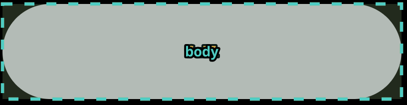 |
| Button (preset mode, area icon) | body = card area excluding icon strip · full = full card area · icon = icon strip only  |
| Button (component mode) | Named zones sourced from the SVG component's internal zones definition — these are declared by the component pack, not by your card config. You can add additional custom zones if desired. 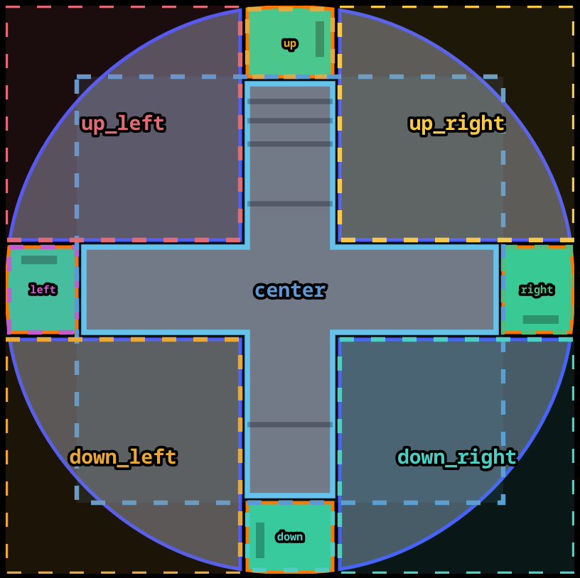  |
| Slider | track (inner track bounds) + one zone per enabled border: left, right, top, bottom 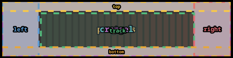 |
| Elbow (simple, L-corner left) | vertical_bar · left_bar (alias for vertical_bar) · horizontal_bar · body · full 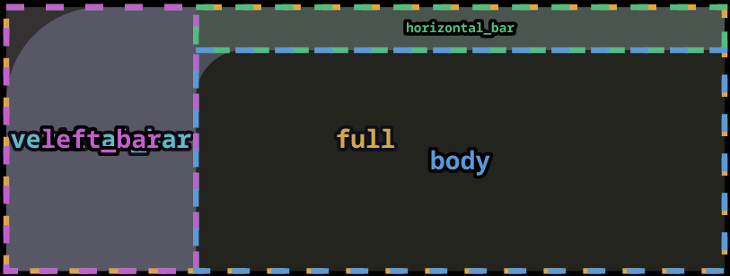 |
| Elbow (simple, L-corner right) | vertical_bar · right_bar (alias for vertical_bar) · horizontal_bar · body · full 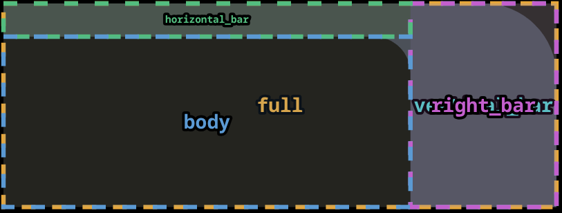 |
| Elbow (simple, open) | horizontal_bar · body · full — no vertical bar zone 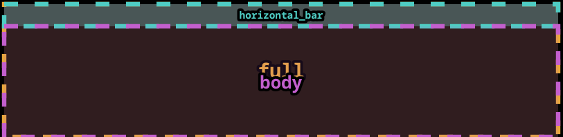 |
| Elbow (simple, contained) | left_bar · right_bar · horizontal_bar · body · full 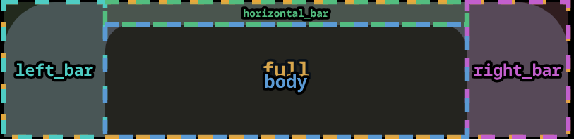 |
| Elbow (segmented) | outer_vertical_bar · inner_vertical_bar · outer_horizontal_bar · inner_horizontal_bar · body · full 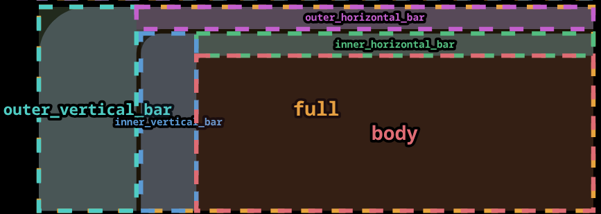 |
| Elbow (frame) | top · bottom · left · right · body · full 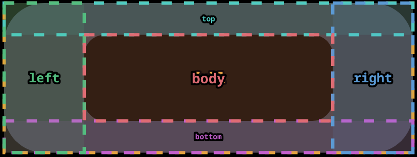 |
Routing a field to a zone
text:
  label:
    content: "Brightness"
    zone: horizontal_bar     # render inside the elbow's horizontal bar
    position: center
    font_size_percent: 60    # 60% of the horizontal_bar height
Fields without a zone: key fall back to the card's primary zone (body, track, or the first enabled border).
Custom zones (config.zones)
You can define additional zones or override auto-calculated ones with config.zones. Values accept pixels, percent, or a mix per axis:
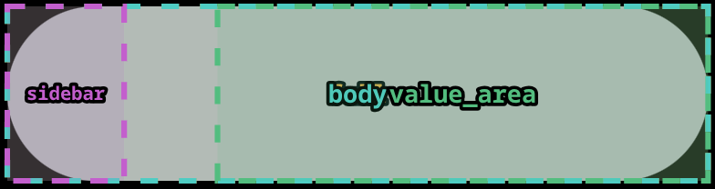
zones:
  sidebar:
    x: 0
    y: 0
    width: 80
    height_percent: 100     # full card height, fixed 80 px wide

  value_area:
    x_percent: 30
    y_percent: 0
    width_percent: 70
height_percent: 100| Key | Type | Description |
|---|---|---|
x | number (px) | Left edge in pixels |
y | number (px) | Top edge in pixels |
width | number (px) | Width in pixels |
height | number (px) | Height in pixels |
x_percent | number (0–100) | Left edge as % of card width |
y_percent | number (0–100) | Top edge as % of card height |
width_percent | number (0–100) | Width as % of card width |
height_percent | number (0–100) | Height as % of card height |
px dimensinos takes precedence over percent when both are present on the same axis. Percent values are resolved against the card's actual rendered pixel dimensions at rebuild time, so they are responsive to card size changes.
Custom zone names that match an auto-calculated zone (e.g. body) replace the auto-calculated bounds entirely.
Zones can be managed visually using the Zones tab in the card editor.
Debug overlay
Set debug_zones: true on any card to render a coloured, dashed overlay showing every zone's bounds and name on top of the card. Useful when designing text layouts or diagnosing zone placement.
type: custom:lcards-button
entity: light.kitchen
preset: lozenge
debug_zones: true
zones:
  sidebar:
    x: 0
    y: 0
    width: 60
    height_percent: 100
The toggle is also available in the Zones → Developer Tools section of the card editor. Remove or set to false before committing your dashboard config.
font_size_percent and cap_height_ratio
font_size_percent: 100 makes cap-height letters fill the full zone height. The SVG font-size attribute is set to zone_height / cap_height_ratio so the visible cap-tops span the entire zone; font_size_percent: 50 makes them fill half the zone height, and so on. The text is optically centred at the target position via a matching y-shift.
The default cap_height_ratio is 0.86 (measured for the Antonio font used in LCARS themes — at this value font_size_percent: 100 causes caps to fill the zone exactly). Set a custom value on any text field to calibrate for other fonts; cap_height_ratio: 1.0 means caps equal the full em-square with no correction.
font_size_percent controls the vertical fill; add stretch: true to also fill the horizontal axis. The two are independent — SVG scales glyph spacing via textLength without affecting font size:
text:
  label:
    content: LCARDS
    zone: zone_1
    font_size_percent: 100   # caps fill zone height
    stretch: true            # glyph spacing fills zone width
Display Format
The display_format option controls how entity state and attribute token values are rendered. It is valid on any individual text field or as a card-wide default in text.default.
| Value | Description | Example (door sensor) |
|---|---|---|
friendly | HA-translated display string — matches native HA cards (default) | "Open" |
raw | Unmodified state/attribute value from hass.states | "on" |
parts | Value and unit joined from HA's ToParts API | "23.5 °C" |
unit | Unit portion only from HA's ToParts API | "°C" |
YAML Examples
Door sensor — show friendly state:
text:
  status:
    content: "{entity.state}"
    display_format: friendly   # "Open" or "Closed" instead of "on"/"off"
Temperature sensor — show just the unit:
text:
  unit_label:
    content: "{entity.state}"
    display_format: unit       # "°C"
Raw value for logic in JS template (display_format not needed here):
text:
  raw_debug:
    content: "[[[return entity.state]]]"   # JS templates always receive raw values
Card-wide default — all text fields use friendly display:
text:
  default:
    display_format: friendly
  label:
    content: "{entity.state}"     # inherits friendly from default
  value:
    content: "{entity.attributes.battery_level}"
    display_format: parts         # overrides default for this field: "80 %"
Notes
display_formatonly affects display strings. State classification logic (active/inactive/unavailable) always operates on raw state values.[[[JavaScript]]]templates are unaffected — they always receive the raw entity object. Callhass.formatEntityState(entity)directly if needed.- Jinja2 templates (
{{ ... }}) are server-evaluated and unaffected. - When
show_unit: trueis set on a slider or text field, the unit is derived from HA's ToParts API to ensure it matches HA's own display exactly.